PROJECT ORION
A visual identity crafted to launch Blackhawk Network’s bold new chapter.
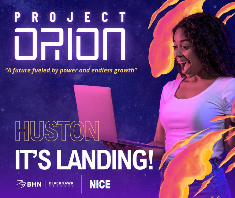
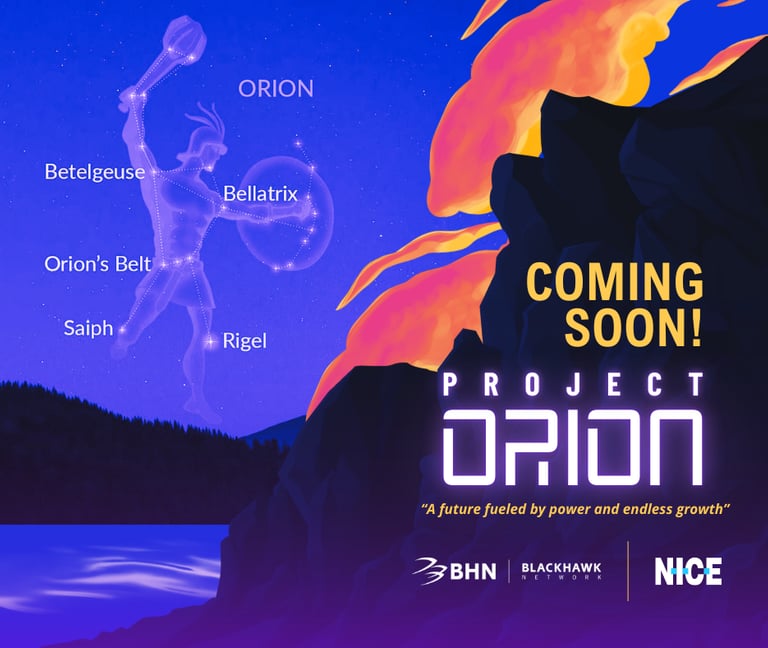
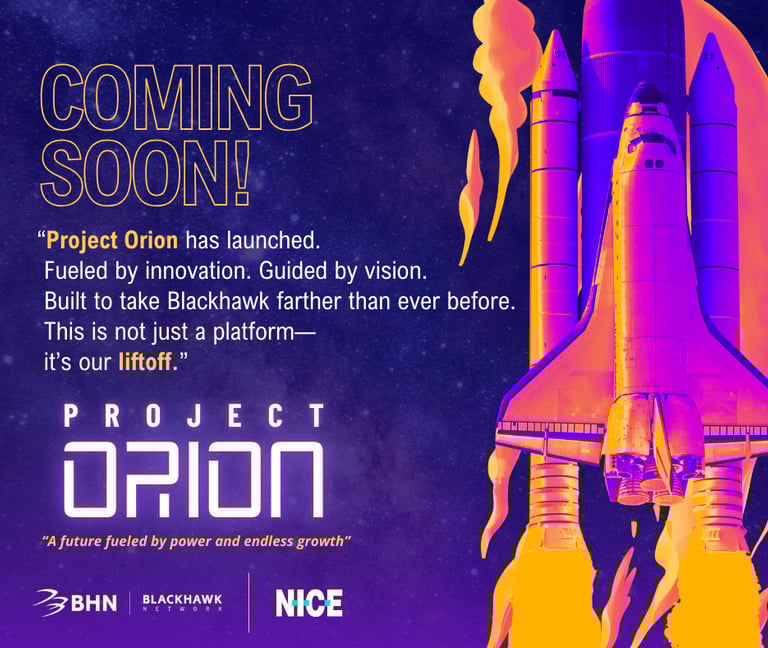
Project Orion is Blackhawk Network’s bold step into a new era—powered by their acquisition of the NICE platform. We were tasked with creating a complete visual identity and promotional concept that captured the project’s ambition, innovative spirit, and transformative impact.
How it started
Blackhawk Network began a major transformation with its acquisition of the NICE CX Platform—an advanced customer-experience system designed to strengthen performance, efficiency, and data-driven decision-making across the organization. While the platform offered powerful technology, it needed a unified identity that could communicate its strategic importance, energize internal teams, and set the tone for its launch.

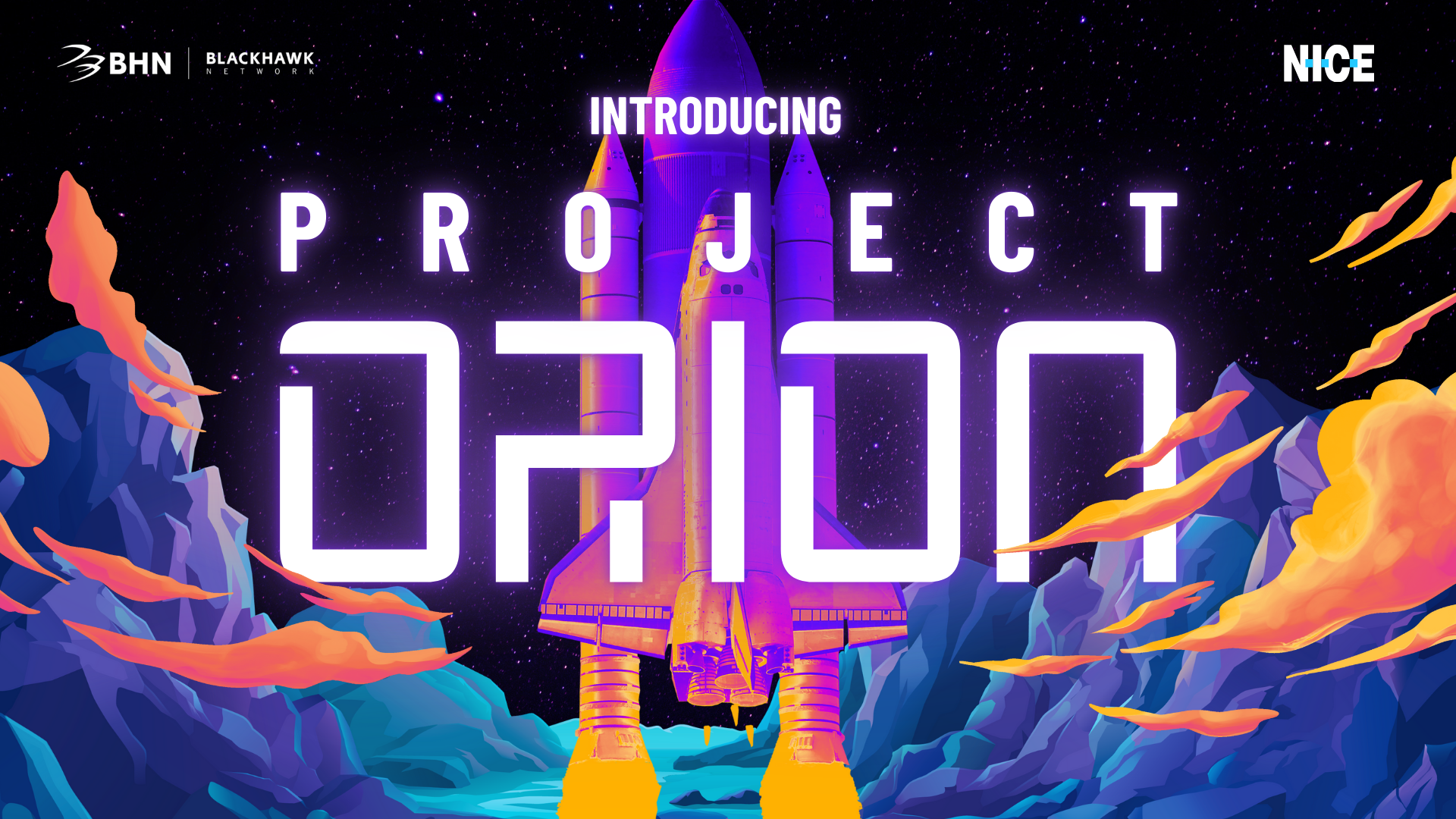

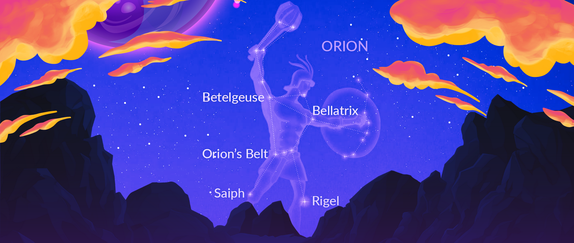
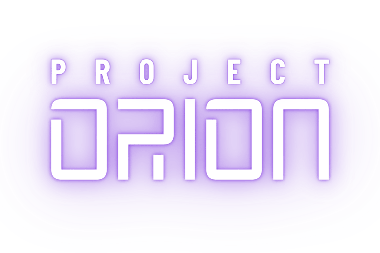
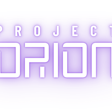
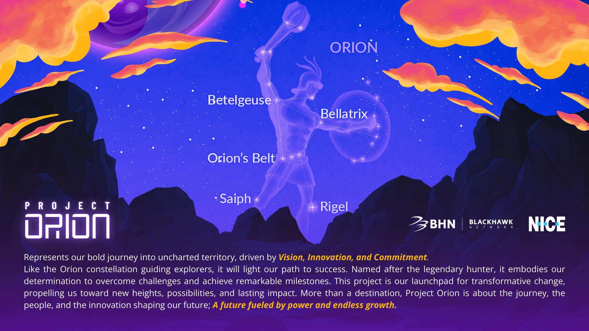
For Project Orion’s visual identity, we developed a bold wordmark built using the Space Age display font—a futuristic typeface that immediately evokes exploration, innovation, and the vastness of possibility. Because the initiative’s name carries strong astronomical symbolism, the logo needed to speak directly and unmistakably to its mission: forward momentum, discovery, and technological evolution. The clean geometric forms and sci-fi aesthetic of the typeface allowed the wordmark to feel both modern and aspirational, aligning perfectly with the spirit of Orion as a guide into new territories.
THE LOGO
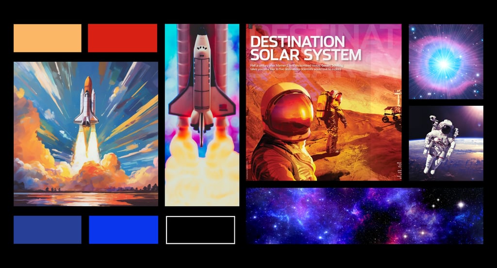
THE CONCEPT
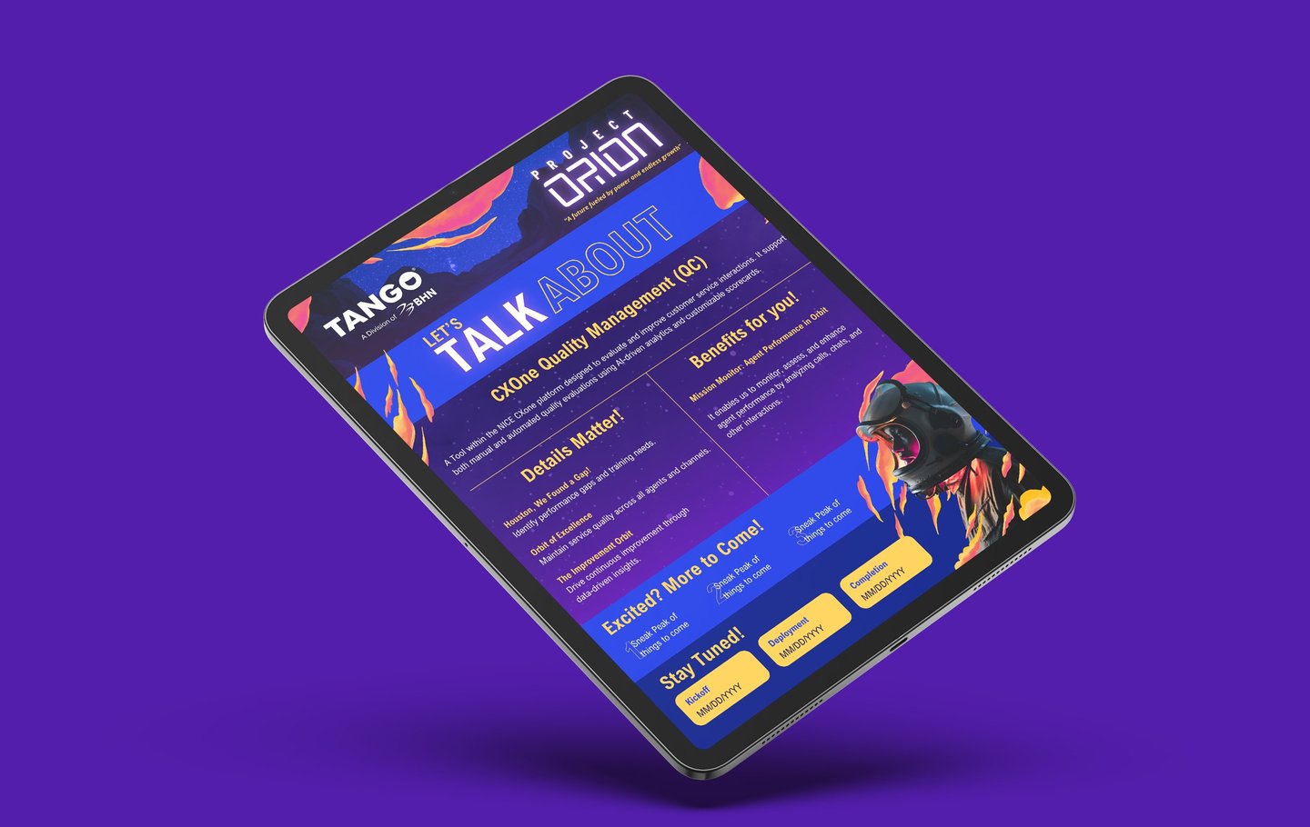
NEWSLETTER